It began with a bunch of ranunculus from my Mum. There was a tenacious one in the mix that held on for weeks. As its petals started withering and losing their moisture, an intricate vascular network emerged that looked like the fine lines on an ageing face. I decided to photograph the petals on some bricks and so began the series, flowers on bricks. When we start to pay attention to something it has a way of weaving its way into all areas of our life. My thoughts moved from dinner to dahlias, from the hydro bill to begonias, from an earache to crocuses. Flowers were everywhere. And I wasn’t just seeing them, I was feeling them. The cellular level joy that comes from being utterly absorbed in something we love.
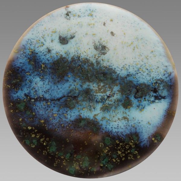
Flux is a ceramic glaze that’s added underneath or over top of another glaze to create movement in the way of mottling, rivulets and streaks. It also highlights hidden colours within a glaze resulting in unexpected combinations. As an example, I used flux over a cerulean blue on the rim of a bowl last week and it unleashed a riot of reds, copper and chartreuse. It’s the element of surprise that makes working with flux so exhilarating. And terrifying. Given how controlled and deliberate I am –- I’ve worked with the same two colours for a decade –– flux is new terrain for me. I feel like each piece is a collaboration between myself, the glaze, the kiln and the clay. There are four of us in this relationship, a kind of wild alchemy with no one in total control. And the outcome can be glorious and disastrous. Regardless, the anticipation has ignited something in me that I haven’t felt about clay in a while; excitement, curiosity, the feeling of starting a new.
I’ve waxed lyrical here before about my love of peonies. Given all the rain lately we’re in for a show this year. Coral Charm is my very favourite because it goes through so many incarnations, from vivid coral to faded peach to a bisque white with the faintest hint of its original coral. “What is my experience of the flower if it is not colour?” wrote the artist, Georgia O’Keeffe. When I think of peonies there’s so much more that captures my attention than colour –– texture, shape, grandeur –– but it really is that coral that quickens my heart, and the creamy white (the shade of a Victorian nightgown) that softens it. Blink and it’s already turning from coral to peach. Blink again and it’s cream. And then gone.
In the 80’s, my Mum had a dress that was tiny and ruffled and pink and to this day it conjures images of a flamingo’s downy feathers, a dancer’s tulle skirt and a peony spayed wide open in the midday sun. It was made from moiré silk and had a wavy texture reminiscent of the sea. A pink ocean of a dress. I wrote last week about mustard and where my love for it began. My love of pink is next level. From Renoir flesh to high wattage neon, there isn’t a pink I do not adore. It’s hard to articulate my love of pink because it’s so inextricably linked with my Mum and that dress. These photos I took come somewhere close.
It was late last summer that I started thinking about seed pods, the protective shell for developing seeds. The universe is cunning in that once we turn our attention to something iterations of it appear at every turn. Thistle seed pods imprinted in terracotta clay in the windows of Loro Piana; Karl Blossfeldt‘s exquisite poppy seeds on the packaging of a Loewe’s perfume. Jonas Frei‘s photographs. Akiko Hirai‘s organic forms. Milkweed, wild mustard, Kentucky coffeetree pods. Visiting Nan Shepherd in the winter was a privilege because few people see the world with her sensitivity and rigour. Nan’s collection of dried botanicals –– well into the hundreds –– is encased in tiny handmade boxes with glass tops. Each one is numbered, and she keeps a hand-written log with every detail of each seed, flower, bone and shell including where she found it. A few weeks after my visit with Nan, I sat at my kitchen table while it was still dark outside and made twenty double bowled vessels inspired by all that I’d absorbed. As the sun came up on the day, I felt like I’d achieved a week’s worth of work in one morning. The pods sat in my kitchen drying for weeks and weeks until I finally glazed and fired them this week. One of the big ones cracked straight down the middle which given how I’ve been feeling lately is about right. My children are growing up. I can’t protect them from life. All mothers know this, rationally. But love and fear are rarely rational, and once upon a time, I breathed for them. I considered joining the two halves with glue and gold leaf, but I’m starting to think that with some gentle sanding there can be two very beautiful vessels.
Every time my Mum visits from England she leaves something behind. Sometimes it’s her scent, woven in to a cushion or a tea towel. Other times it’s a drain snake for the build-up of hair in our bathroom sinks. This time, she left us a 1000-piece puzzle strewn loosely all over the kitchen table. It’s a vibrant collage of Mediterranean windows, several of which she assembled while we put the world to rights over tea and toast. One anxious morning last week, I found real calm and focus in the tiny terracotta pots that lined the sills of one of the many windows. My son organizes the pieces while he eats his cereal in the morning and my youngest daughter treats the puzzle like a late night meditation. Every day, one of us sits down to add something. I just love that she’s still here, scattered all over our kitchen table, yellow bunting, green shutters, geraniums in every shade of pink.
One of the things I love about clay is that it has so many states. And that each state corresponds (in my mind, at least) with the human cycle. Clay begins soft and malleable, and full of possibility. It’s in this pliable state that it remembers everything. As it dries, it morphs into its most delicate state, dusty, fragile and as breakable as brittle bones. In the kiln the clay vitrifies and is no longer as porous but still can’t hold water. The second firing –– where glaze is applied –– completes the cycle. It’s here that the vessel is as strong as it’s ever going to be. I’m always amazed by how much a ceramic vessel can withstand. After all, our museums are filled with clay pots that have been around for millennia.
Three gold hoops, two diamond bars and a lightning bolt of emeralds is what women –– mostly in their mid 20s and 30s –– have on their ears these days. The craze for the curated ear shows no sign of waning with every part of the ear –– helix, conch, snug, rook –– getting glitzed. It’s one of few trends I’m into. I like the look of a fully stacked hand and I like the look of a fully stacked ear. If you’re lucky, your jewellery tells the story of your life. Selma Hayek said that. I wear a single stud in my right ear as an ode to my love of asymmetry. There’s no symmetry in nature. I’ve worn it for years, and I’ve lost it and found it a dozen times. I do like a stacked lobe, though. Add a helix huggie and a poppy seed sized diamond in the rook and you’ve got a veritable buffet of bling. Maybe next time around.
Everywhere I turn, I see dead birds. Last week I found a dead Finch with a flash of yellow feathers flat on its back in our garden. I buried it under a pile of periwinkle. And this week, I’ve seen three pigeons –– rats of the sky –– splat on the sidewalk among the early Autumn leaves. Are they an omen? A reminder to get a pap smear? Wait, when does my passport expire? Anyway, I’ve been thinking about birds and along came Isobel Harvey and her gorgeous feathered friends. Harvey’s birds are very much alive. Her style is exuberant and childlike (I can see her paintings illustrating a kid’s book of nordic myths) and there really isn’t a painting of hers I wouldn’t hang in my house.